Updated website typefaces bring big changes and better accessibility
- Post Date: 5/10/2024
- Author: Jack Thomas, Director of Information Technology
- Reading Time: 5 minute read
Things are looking a bit different on the Spurlock website lately. Last week, we updated the typefaces used to display much of the text on the website. We are excited that these changes should lead to a better reading experience for a larger percentage of you. With a change this impactful—and because of the reasons for the change—I wanted to highlight some of the context in this post.

Headings
The old approach was based on previous identity standards set by the University. Headings were featured with a unique, eye-catching typeface called Fjalla One. Body text was presented in a popular, readable typeface called Source Sans Pro.
-
 The previous typeface pairing with Fjalla One and Source Sans Pro, in a lighter weight which some users had trouble reading.
While this primary type pairing worked well, we found that Fjalla One was very hard to read with the longer titles that often appear on our website, particularly in the names of events and some exhibits. The University had since conveniently updated their brand standards for headings to replace Fjalla One with Source Sans Pro or a third typeface, Montserrat. As we already use Monterrat for buttons and some titles across the website, we chose to replace Fjalla One with Source Sans Pro. The result, we hope you’ll find, is that titles—even longer ones—are easier to read.

-
 Heading using Fjalla One typeface
 -
 Heading using Source Sans Pro typeface
Body Text
Our choice for our new body text typeface is probably the more notable change in this typography refresh as it’s dramatically different from the previous look. Our implementation leverages newer updates from the University’s brand guidelines (external link) in a way that, frankly, was likely not intended, but in a way that we believe is better for more of you.
Our new body font is Atkinson Hyperlegible. We had been using the University standard Source Sans Pro—albeit in a lighter weight than has since come into standard practice across many campus websites. The new typeface has a heavier weight, which is new for us but pretty standard for typography on the web.
-
 Snapshot of body text from the College of LAS website in Source Sans Pro
 -
 Spurlock body text set in the lighter weight of Source Sans Pro
 -
 Spurlock body text set in the heavier weight of Atkinson Hyperlegible
Visual Impairments and Accessibility
The University branding guidelines direct the use of Source Sans Pro for body text but highlight Atkinson Hyperlegible as a typeface to use when “creating materials specifically for audiences with visual impairments.” I personally find a disconnect here. The World Health Organization published a 2023 report (external link) that claims that 2.2 billion people “have a near or distance vision impairment”. That’s approximately 25% of the world’s population! I haven’t been able to find clear statistics for the United States, but I’m seeing statistics that suggest a minimum of 3–5% of Americans have a visual impairment. It is likely that this lower number is counting only the most severe and permanent cases. Keep in mind that even people who don’t self-identify as being visually impaired occasionally struggle to read certain text or images on their phones, particular after an exhausting day. By thinking accessibly, we can improve readability for these users too —and why not?
Put simply, at Spurlock, we design ALL of our web content with the visually impaired in mind, and I know my colleagues elsewhere in the University agree. This is why I’ve chosen to define our entire website as “materials specifically for audiences with visual impairments” and why Atkinson Hyperlegible has become our default typeface.
Atkinson Hyperlegible
What about those zeroes??
Atkinson Hyperlegible (external link) is a typeface developed by the Braille Institute. Its primary feature is characters that are easy to differentiate from each other. Letters that are less likely confused with each other are easier to read for everyone but especially for readers with some level of temporary, permanent, or situational visual impairment.
In other typefaces, common characters that are similar are the zero (0) and the letter O; the lowercase i and the lowercase r; the lowercase p, q, and g; the capital B and the eight (8); and the one (1), the capital I, and lowercase l. Atkinson Hyperlegible uses various design tricks to help you differentiate these characters.

-
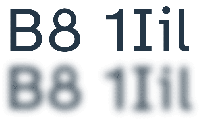 Atkinson Hyperlegible utilizes techniques to differentiate characters that are hard to distinguish in many common fonts.
Credit: Braille Institute Atkinson Hyperlegible (external link)
The zero character is probably the most controversial component of this typeface due to how infrequently zeroes are presented this way in modern digital typography, but its use really center stages the Braille Institute’s goal of making easily distinguishable letterforms. Our use of this typeface in spite of the zero character underscores our commitment to universal access of our content across a wide range of ability.
-
- Share:
- Subscribe to Newletter
- Giving